Learn · Scheduling 101
How to read a Gantt chart: the bars, the arrows and the timescale
After this subject you can read a bar chart the way a scheduler reads one: the timescale first, then the bars, the shaded days, and the arrows, each of which joins two ends.
You already read one of these
A Gantt chart is the picture a schedule makes when the work is laid out left to right against dates. Somebody in your trailer may have one printed on the wall, and you have probably been reading them for years. What this lesson adds is how to read the arrows drawn between them, which is the part one row on its own cannot tell you.
One row, one piece of work
A bar is one piece of work drawn on the chart: it begins where the work begins and ends where it ends. What its width shows is the stretch of DATES the work covers, which is not the same as the working time it takes — the card after next is why. A long bar is not automatically a problem.
The strip of dates along the top
The timescale is the strip of dates across the top that every bar is measured against. Change it from weeks to months and the bars compress while nothing about the work has changed. Read it before you compare one bar with another, or their widths can mislead you.
Why it matters — this is the single most common way a chart gets misread across a table.
The shaded days
Many charts shade the days that are not worked. Those are the non-working days from the calendar the chart is drawn against, and they are why a bar can be seven days wide and still be five working days of work. A bar's right edge is the scheduled finish date: start plus duration, walking the project calendar.
The same picture on a real job
Here is one in the product: the work listed down the left, a bar for each piece of it on the right, and the strip of dates across the top. The arrows between the bars are the links you met in the last lesson. Each arrow joins two ends, and its type is what says which two.
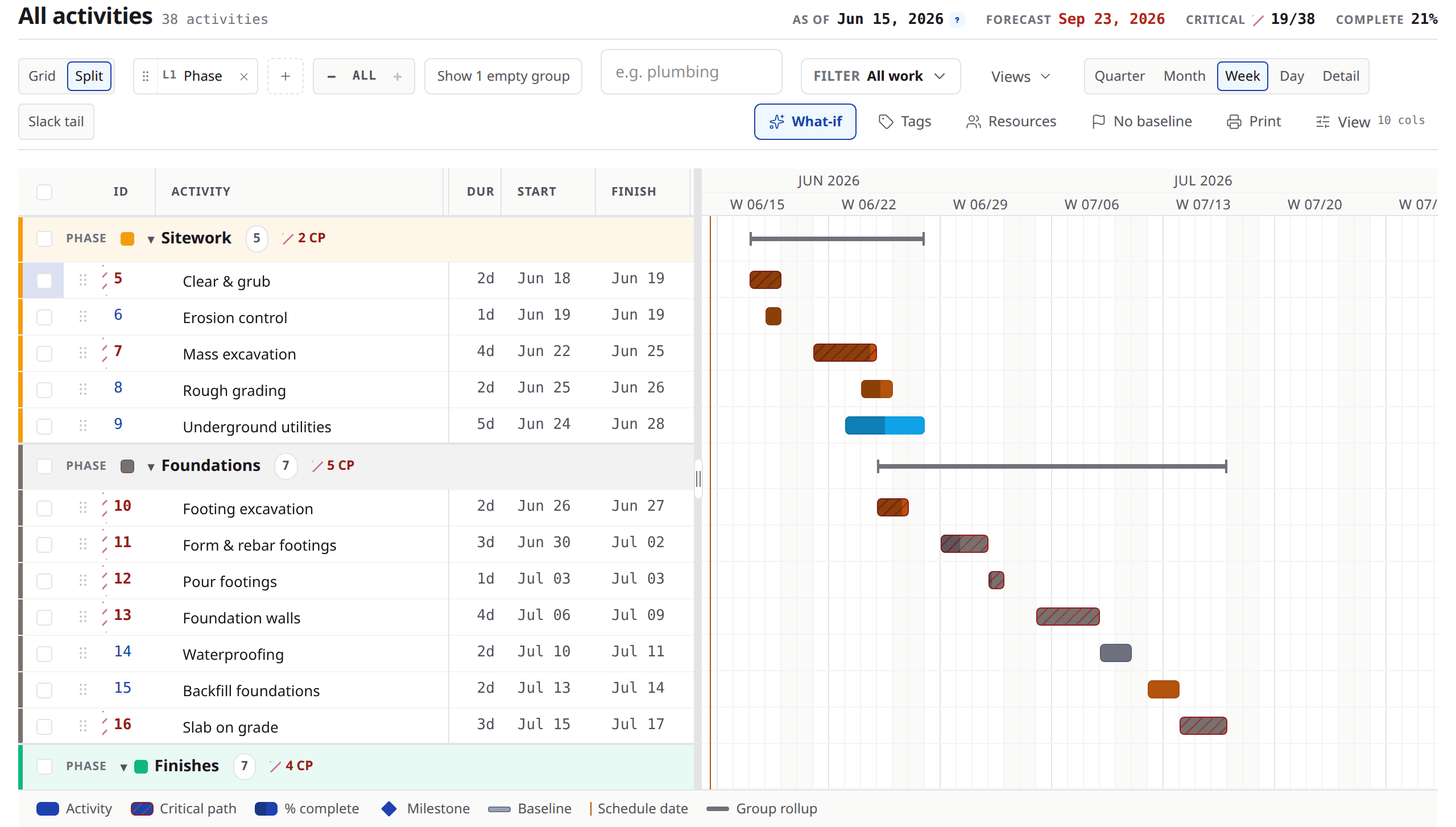
Look at
- 1The bars, laid out against the dates.
- 2The arrows between them, which are the links you drew in the last lesson.
- 3The strip of dates across the top: this one is set to weeks.
Why it matters — some bars in this frame are drawn in a different colour. That colour means something, and it has a lesson of its own further along the course.
Where the picture and the grid meet
Beside the chart there is usually a grid: the same pieces of work, with their dates and how long each one takes written out as numbers. The chart is for reading a shape; the grid is for reading a number. Most people work in both and switch between them without thinking about it.
What the picture cannot tell you
A bar tells you which dates the work covers. What it cannot tell you on its own is why those are the dates — the arrows carry part of that, and the durations and the calendar carry the rest. And paper cannot work a change out again, which is why a printed chart goes out of date rather than telling you so.
Why it matters — the picture is the output. The next lessons are about what produces it.
Reading one across a table
Ask
Which end of this bar has an arrow into it?
Instead of
Why is this one so far out?
Ask
What is the timescale set to here?
Instead of
That bar looks short enough.
Ask
Are the shaded days on this chart my job's calendar?
Instead of
That is only five days of work.
What to remember
- A Gantt chart is the picture a schedule makes when work is laid out left to right against dates.
- One bar is one piece of work: where it begins, where it ends, and the stretch of dates between.
- Read the timescale before you compare two bars, or their widths can mislead you.
- The shaded days are the ones the chart marks as not worked — check which calendar they come from.
- The arrows are the links, and each one joins two ends; the picture shows the answer, not all of the reasoning.
Read one chart end to end
Open a project, switch to the chart, and read it in order: the timescale first, then the shaded days, then the bars, then the arrows between them. For each arrow, say out loud what it is telling you. If you would rather do it on your own job, bring a schedule to a demo and we will read it together.
Carry on
Lesson 05 of 12